Restaurant Statistics
Brief:
- A new survey found that 77% of diners visit a restaurant’s website before they dine in or order out from the establishment. Of that group, nearly 70% have been discouraged from visiting the restaurant because of its website.
- Of 1,101 U.S. adults surveyed, the vast majority of diners (69%) said a restaurant’s website helps them decide if they want to dine in, while 43% visit the website to decide if they want to order takeout or delivery.
- The biggest factor behind diners’ decisions to visit a restaurant after looking at its website were the items on its menu, though some diners said that a restaurant website’s sub-optimal ease of navigation, readability or its food photography might turn them off from ordering.
Insight:
Though it’s a no-brainer that a consumer would be persuaded by an enticing menu displayed on a website, that’s not the only driver behind their decision. Surveyors also found that 33% of consumers were discouraged by a difficult-to-navigate website, and 30% were because the restaurant’s website looked old or out of date.
Indeed, first impressions are critical when it comes to restaurants, which is why most consumers would swear off an establishment if it had dirty bathrooms (82%), tables (74%) or floors (66%) or outdated decor (60%). A website’s presence is no different, especially as most customers go there first.
As delivery and takeout channels continue to grow in the restaurant space, those features are even more critical to get right digitally. If it’s challenging to navigate an online ordering portal, chances are high that customers will abandon their carts and go elsewhere.
This is also true for mobile-friendly websites. Restaurants that don’t have responsive design to display their information seamlessly on a mobile phone could be at a significant disadvantage as food orders placed via smartphone and mobile apps are expected to become a $38 billion industry by 2020. Chipotle is a case study here. The chain’s website won a Webby Award in 2017 for its responsive web ordering feature. Coincidentally, the chain is now a standard-bearer of digital ordering, generating 18.2% of all Q2 sales through mobile and online channels — a 99% increase from the same period last year. The company also clocked a 10% comparable sales increase during the quarter, well above the average for the industry.
Overview/Case Study: JohnnysWifesPlace
A business’ website is crucial to building their online brand. It is where customers go to get contact information, browse products or services, and just overall learn a little more about the company. Our case study client came to us wondering why they weren’t getting much business from their website. While they did have a website, it was missing a lot of features that make it user friendly. With our website design skills and knowledge, we were able to completely revamp this client’s website into something they are truly proud of. Keep reading to find out how the transformation of this client in the restaurant industry’s website increased business.
Load Time
When this client came to us their website was taking close to 6 seconds to load during peak hours, which is entirely too long. Did you know that over 40% of people will leave a website and go to a competitors site if the page takes more than 3 seconds to load? That being said, load time is crucial to a website. We were able to provide this client with a beautiful website that loaded quickly. This greatly persuaded many customers browsing the site and they would go to this restaurant or order take out, since they had no wait time to reconsider another option. Page speed is also an SEO ranking factor, so not only did this help better user experience but it also positively contributed to their SEO.
Design/Navigation
In 2020, a business website is usually the first interaction you have with a potential customer. For this reason, a website that is easy to read, looks nice, and is easy to navigate is crucial. Before MarketingAndDesign.com, this case study client’s website design was not organized and very hard to find what you were looking for. We changed all of that. Now, this client has a website that is aesthetically appealing, organized, and represents their brand. Users are able to navigate through the different pages with ease and have a much more positive experience while on the site. We added direct options for Online Ordering and click to Call button, making it even easier for customers to instantly interact with the business.
SEO Optimized
There are different methods that can used in SEO, one of them being on page optimization. This deals with optimizing your website for search engines and our case study client’s original website was not taking advantage of this SEO technique. When building out their website, we were sure to include rich content across all of their pages, we updated all their markup/title tags and meta fields to also include things like location based keywords. We also hosted their website on faster servers, which reduced the load time. A reduction in load time leads to a lower bounce rate and also contributes to better rankings.
Responsive Design
Another important feature, which contributes to better SEO, is the responsive design. The original case study website was not optimized for mobile devices, which makes the experience less user friendly and can negatively impact SEO. Google algorithms take into account the usability of a website and how easy it is for users to access across all of their devices. A responsive design website ranks better on Google. Without a responsive design, users on their smartphones and tablets weren’t able to access the menu. This caused them to get frustrated and choose another place to eat. Now their menu is easily accessible and easy to read across all devices.
If your website needs an update, contact our office at 724-343-3073 or connect with us online here. We would love to help your businesses grow through the internet!
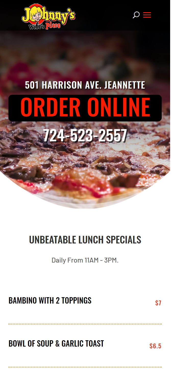
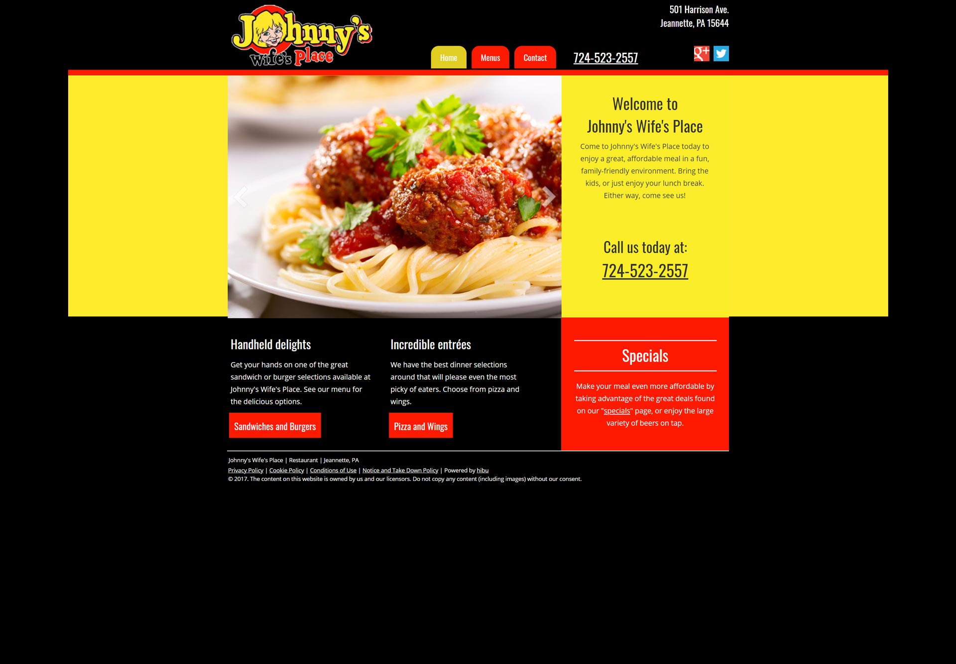
Before – Desktop
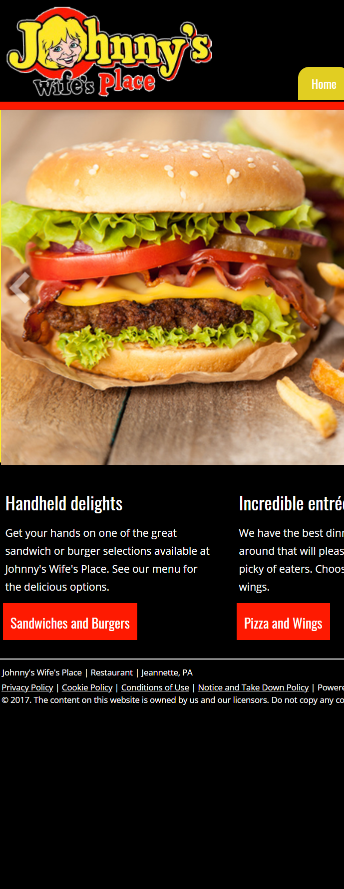
Before – Phone/Tablet
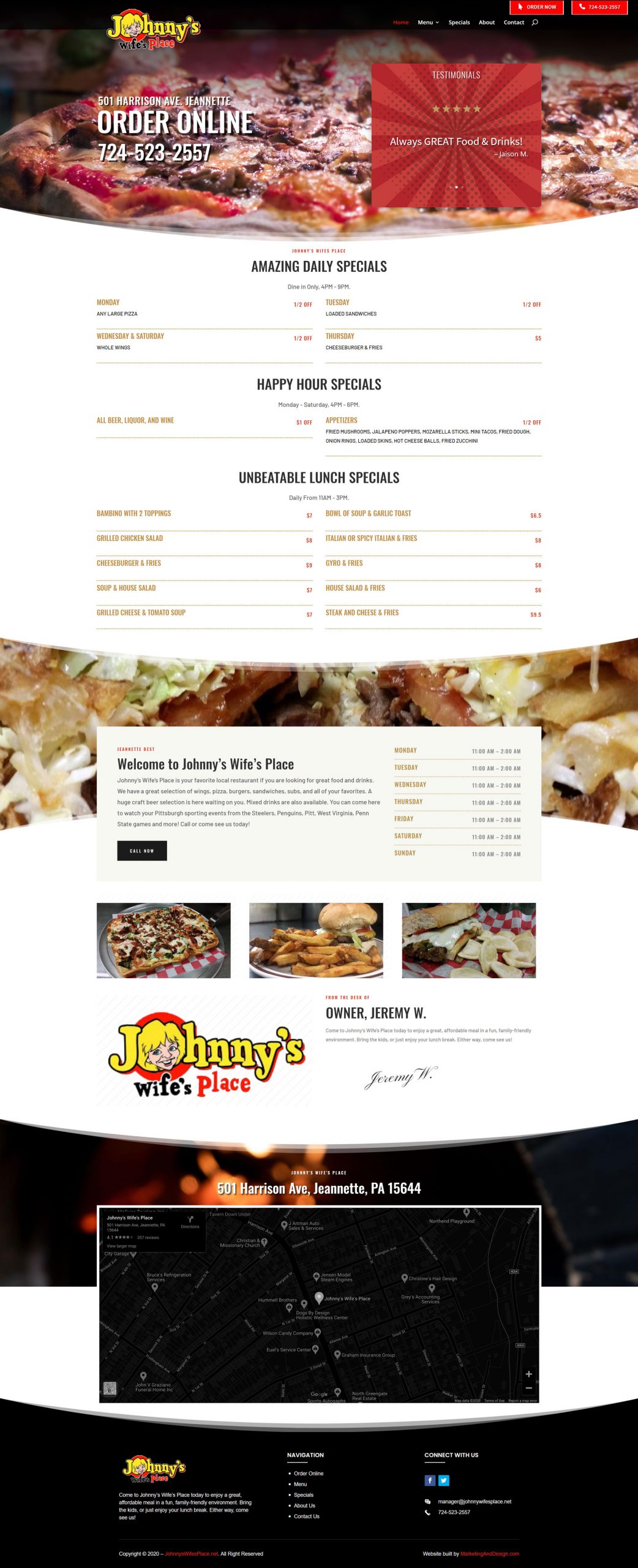
After – Desktop
After – Phone/Mobile